


我的荣耀 开启荣耀之旅

The Story Behind HONOR's Website Redesign

Redesigning a website is not just a matter of applying a new skin to an existing structure. There are, in fact, many puzzle pieces at play from architecture, user experience, interaction, animation, art direction, copywriting; have I forgotten anything?
The brand is, of course, one of the main aspects to keep in mind. What's our overall message? How do we effectively communicate our values with language and visuals to build our brand?
All these things need to reflect the brand to the point where it can be understood and recognized without the aid of a logo.
When embarking on the design process, the first thing I did was research the old website, take notes, then compare it with our competitors. What I noticed was a very similar layout, color palette, and general look and feel. White was a dominant color on all pages across all websites. You could almost swap the logos out, and any site would fit any brand.
But I wanted HONOR's website to be tailored to the brand; not just look like a generic template. To distinguish ourselves from the competition I thought we could try having black as the dominant color in the background, header, and footer of our pages. Besides that, our "Moving Color" gradient popped out on dark backgrounds exceptionally well and was another reason to go in that direction.
HONOR's brand gradient is very bright and alive. I wanted it to be an accent across all pages but used it sparingly to avoid distraction from the actual products. The gradient should always highlight the content, NOT BE the content.
Speaking of Moving Color, the actual movement could be another design weapon for me. I wanted the website to have things happening as the user was scrolling. The focus should still be on the products, so nothing too crazy should be going on around them. Smooth fade-ins, slow transitions, and minimal geometric shapes moving in or out of the pages. These animations are meant to make the pages come alive, be more refined, and make the act of scrolling enjoyable and surprising.
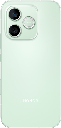
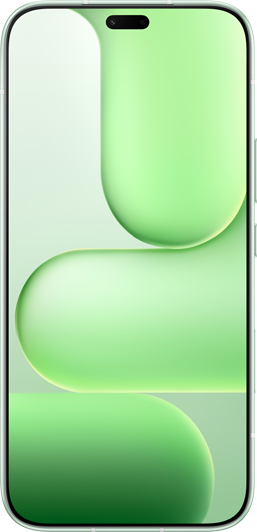
As I mentioned above, the products are the main attraction. For this reason, I decided to have bigger photos compared to the old website. Not just on the featured products, but on the thumbnails in the main navigation menu too.
HONOR smartphones have such great designs with memorable colors, and I wanted users to revel in this as much as possible. Therefore, large photos were the only choice to achieve this.
Following the same logic, I kept the UI of the website very minimal. This extended to all components, including backgrounds, icons, buttons, input fields, and so on.
It's a stylistic choice to not follow contemporary trends in visual design, but also to highlight the devices and let them take the stage.
I hope old and new HONOR fans alike will appreciate the new website and enjoy browsing it as much as I loved designing it!
Rubens Cantuni, Senior Visual Designer
Products Recommend

Latest Blogs
Copyright © Honor Device Co., Ltd. 2020-2026. All rights reserved.
![]() 粤公网安备44030002002883号 粤ICP备20047157号
粤公网安备44030002002883号 粤ICP备20047157号